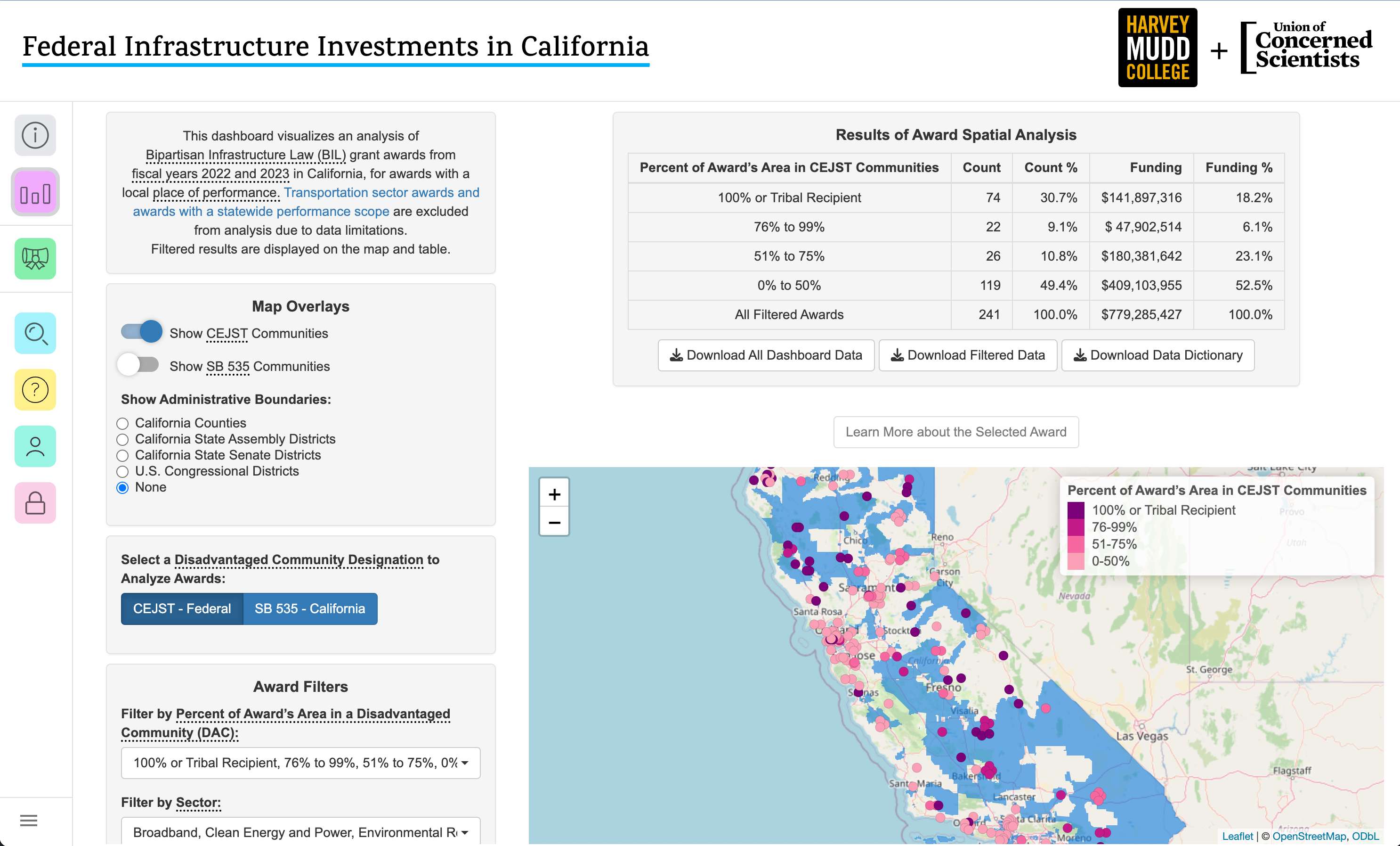
The dashboard from Follow The Money.
While at Pitzer College I lucked out and was able to declare my major as a Computer Science major at Harvey Mudd College. Almost all CS majors at HMC complete a capstone project in the form of a CS Clinic Project. HMC partners with external companies, and assigns a team of four to six students and an advisor to solve a problem for a company. These problems are typically described as:
"Unerased white board problems. Problems that aren't mission critical, but if given more resources and time, questions that companies would like to answer." - Zachary Dodds
For my clinic project I worked in a team of four for the Union of Concerned Scientists on Follow The Money over the course of 8 months. The project centeres on the Justice40 Initiative, a federal commitment to environmental justice created in 2021 by President Biden through Executive Order 14008. It makes a commitment that at least 40% of the benefits from certain Bipartisan Infrastructure Law investments flow to communities that have historically been underserved, under-invested in, and overburdened by pollution. The goal with Follow The Money was to see whether this goal was being met in California. The end result was an interactive dashboard and a report detailing how Justice 40 goals were being met in California.
🧑🔬 Federal Infrastructure Investments in California
The project's roadmap.
We first started with fetching and cleaning all funding data. This was sourced from the USAspending.gov api and categorized by Disaster Emergency Fund Codes. While this was happening, we were deciding how to treat location and geo-spatial data. Some award data was state-wide, others were by county, and some by census tracts! To answer the question we set out to answer, we needed to find a method to measure how much an award benefits a disadvantaged community. This would be how much an award’s place of performance overlaps with a given disadvantaged community using SB535 and CJEST spatial data.
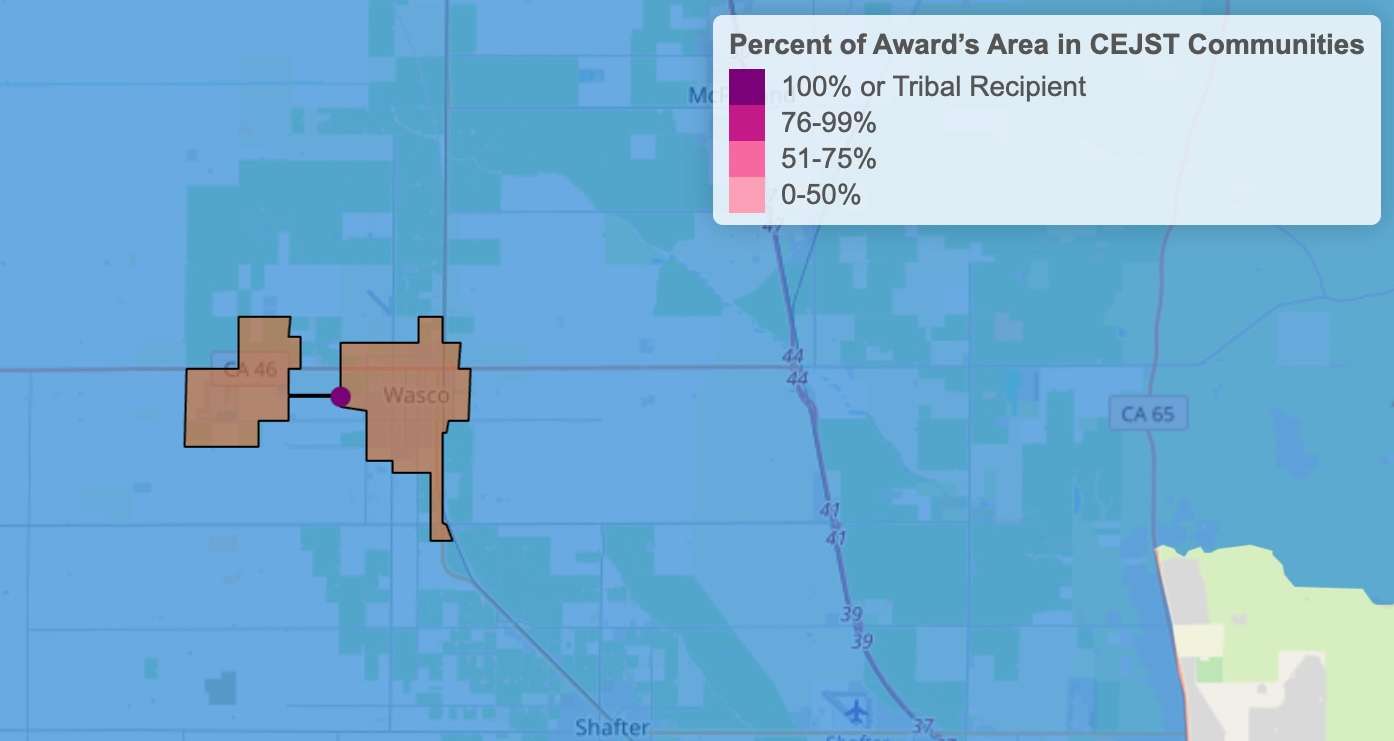
An award with 100% disadvantaged community overlap.
Our analysis had some large caveats. One such caveat was the exclusion of transportation funding. This makes up ~88% of BIL funding, but analyzing it would be beyond the scope of this project. Take for instance a highway that cuts across multiple disadvantaged communities. Would the highway bennefit those disadvantaged communities, or DACs? What if jobs are being created in that area? What if homes are being seized for highway construction? Could people benefit from more robust transportation in their community? Could there be harm from pollution? This is too difficult of an answer for a few CS majors to answer across many awards, and there already is a tool for measuring this, so we decided to forgo transportation data.
The next caveat was state-wide vs. local awards. We excluded all state-wide awards as it can be difficult to determine if an award benefiting all of California is one that invests in DACs as much as affluent communities.
🧑🔬 Coding!
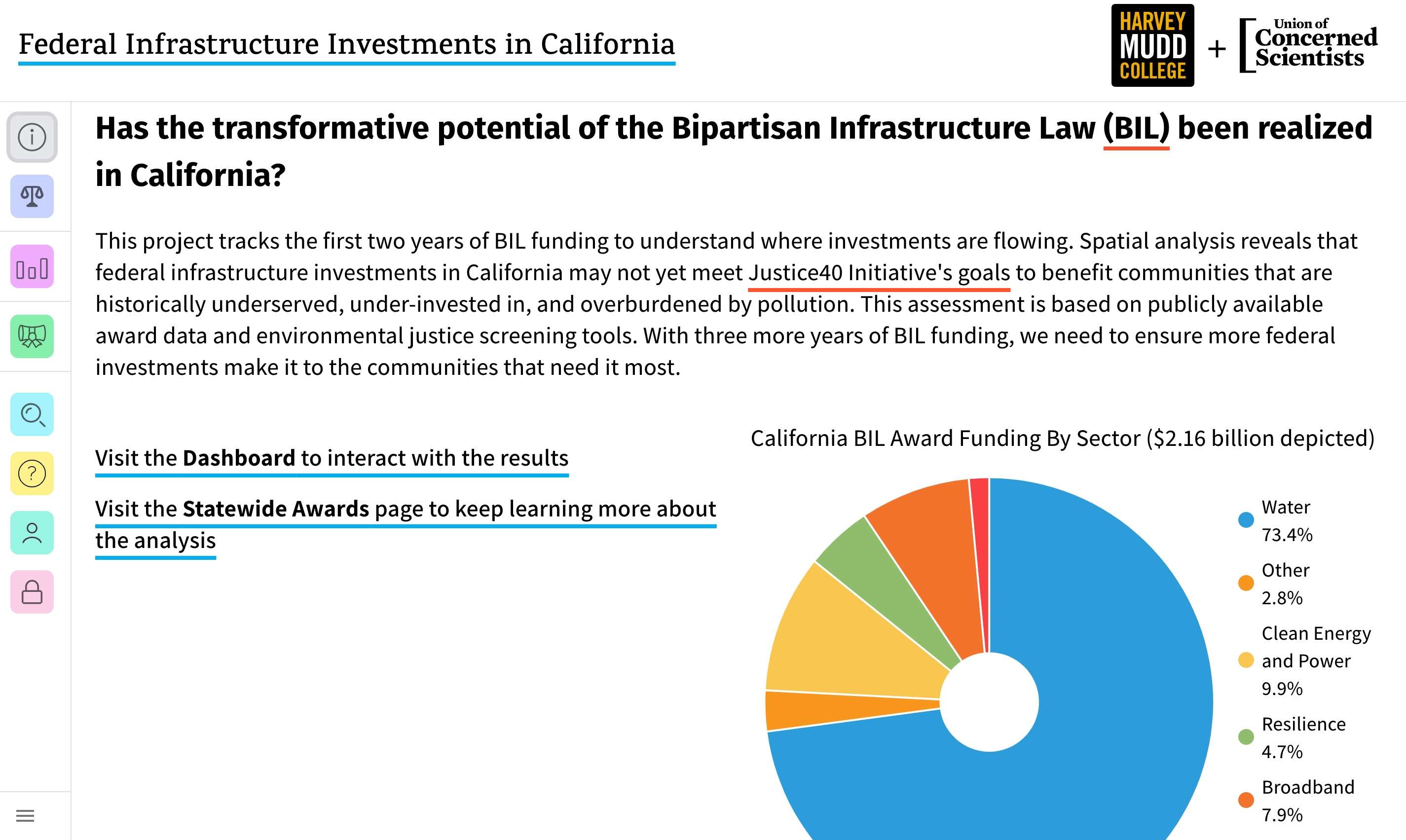
The website we created.
We ended up creating two different websites. One was a single page website made in React, with routing to the about us page, state-wide awards page, and the dashboard page. This would contain our key findings like funding by sector, statewide vs local awards, and what agencies were receiving the most funding. MaterialUI components were used in creating the website. Tooltips were added to define key terms and charts and graphs were made using Victory.JS to display key statistics. The second page was the dashboard, made using R Shiny. This was then hosted on ShinyApps and embedded in the website.
🧑🔬 Meeting With Stakeholders!
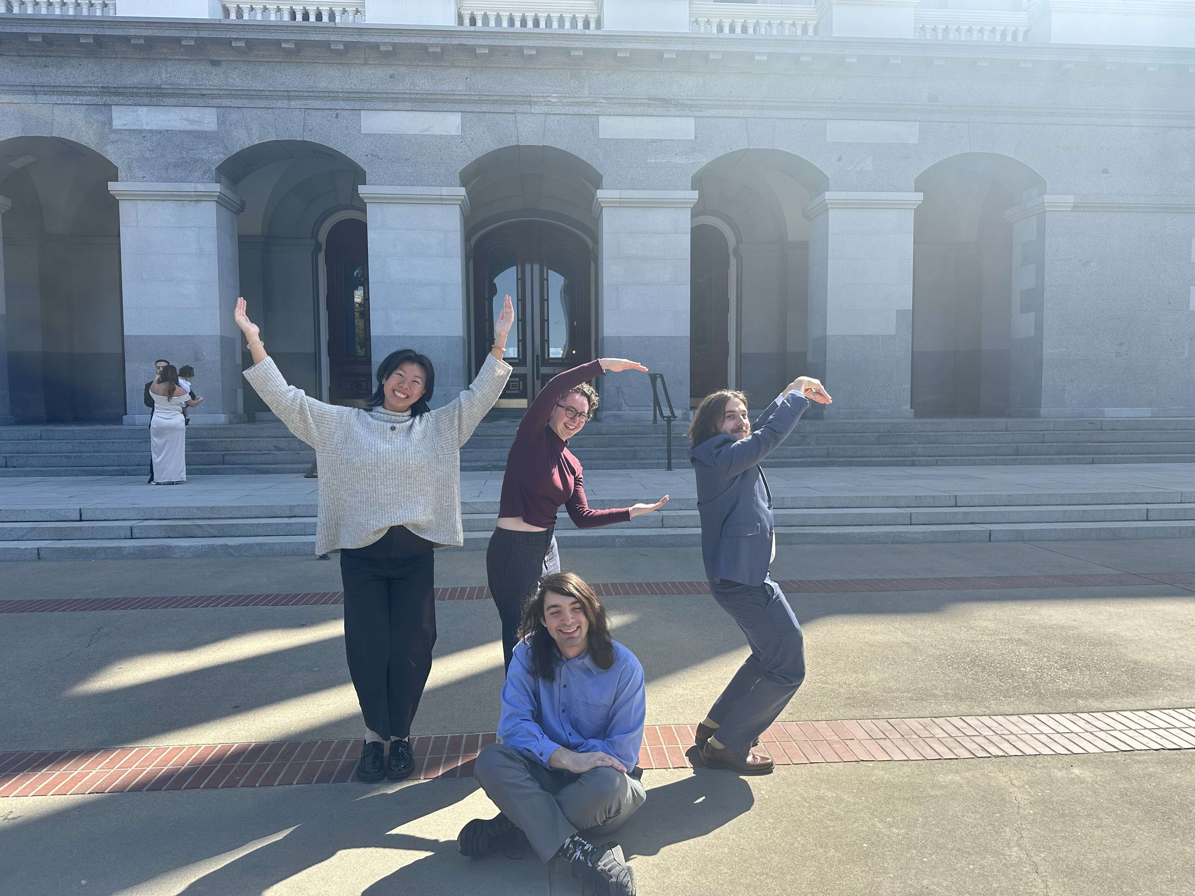
Making a UCS at the State Capitol Building!
Typically clinic teams go on a site visit to visit the company they partner with. Our site visit was very atypical as we did not visit the Union of Concerned Scientists offices but instead visited the California State Capitol. We met with our UCS liaisons and different groups of policy makers interested in using our dashboard. This included members from California State Water Board, State Senate Natural Resources and Water Committee, Joint Legislative Committee on Climate Change Policies at the State Assembly, Water Parks and Wildlife Committee for the Assembly Speaker, and the Farm Equity Advisor at the California Department of Food and Agriculture. One piece of feedback received frequently was being able to use SB535 data for DAC’s as well as CEJST data in our dashboard.
🧑🔬 Wrapping Up!
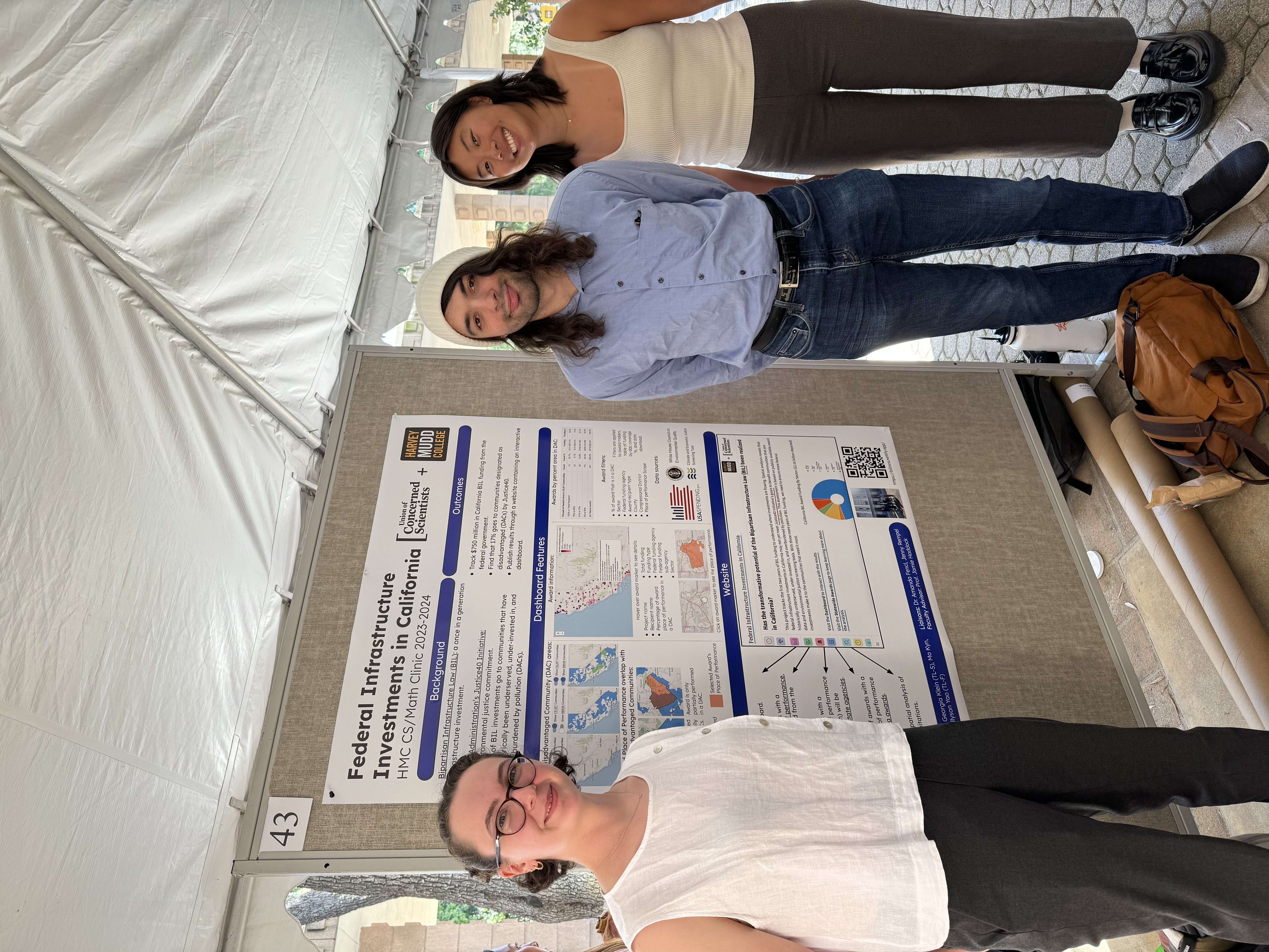
Us at the clinic projects day presentation!
At the end of each semester clinic teams present their work. There is a formal presentation given in Big Shanahan and a poster session held outside. We created our poster and presented for different clinic teams, their liaisons, students, and professors. Once we were done with this presentation our clinic experience was largely done. We documented and submitted our code to UCS web developers who then deployed it here. Afterwards our report was published!
My experience with the UCS and the clinic program has been amazing. Growing up my parents donated to the UCS, and environmentalism has always been a huge part in my life, so being able to work with the UCS on a project that has such a large impact was the best clinic project I could have asked for. My team members were all amazing, and the staff we worked with at UCS were all incredibly kind and hard working. I am so fortunate to have had the opportunity to contribute to this project and am incredibly grateful to the HMC CS clinic program for this experience.
Thank you so much for reading about my project!